
Duration
5 weeks, Oct - Nov 2020
Role
Lead UX Designer
(Team of 2)
OnCampus
Context
OnCampus is an online platform that helps students easily find clubs and communities to join at UCLA. During COVID-19 pandemic, the presence of OnCampus aided students in finding clubs in a virtual space.
Problems to solve
Redesign the OnCampus website’s content display so that the process of students searching for clubs is improved
To implement new features that may be helpful for students looking for clubs
To establish a more branded look on the site
The Problem
Navigating the search for college clubs can be daunting, especially since UCLA has 1,000+ clubs. OnCampus was created in order to better help students find clubs on campus.
When I joined the team in Spring 2020, OnCampus had already been redesigned once before, from just a search engine to one that displayed clubs with cards. Although the site helped students search for clubs, we felt like the content display and navigation of site could be improved to improve the experience of searching for clubs.
Product Breakdown
Critique
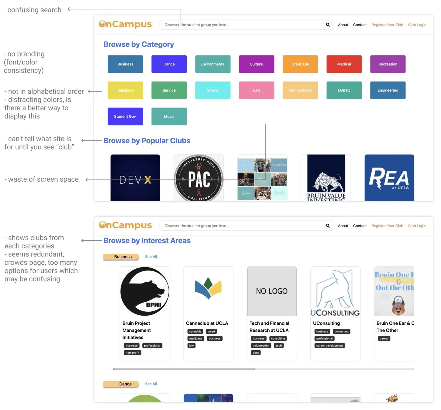
The three main issues we found with the OnCampus site were:
Unclear search: The search doesn’t specify what users should input— club names, tags, interests, etc. This can cause confusion where the user doesn’t know what their next steps are. Search is an important function for websites that involve finding a specific result, which is why I considered this a main issue.
Content display: At first site, the homepage can look intimidating, with the abundance of color, categories, and ways users can search for clubs. Users, especially freshmen who are just starting their club search, may not know where to begin. In addition, the search pages showing club cards only show 2-3 club cards at once, which seems inefficient.
No branding/clear purpose: When arriving on the OnCampus page, it isn’t immediately clear what the site is for. Additionally, there is no branding, with inconsistent colors and fonts, which makes the site look less professional.
User Research
Accessibility
Consistency
Organization
Search
Design Sprint
Consistency
Search


To avoid assumptions and better understand our users, we conducted 7 user interviews and usability tests. We asked questions about club search, such as about sites they used for club search, how their experience has been so far. Then, we proceeded to conduct the usability test for OnCampus live site.
Key Findings
6 out 7 users expressed importance of visual assets
“[Icons] make it easy to find club information, since it would usually be hidden in paragraphs.”
“I like how the logos stand out a lot, it helps me guide me when finding clubs.”
“The categories is a little bland, I feel like having a visual for it would make me be able to find the categories faster.”
5 out of 7 users value efficiency and organization for content display
“The categories seem a little disorganized, it reminds me of Microsoft paint with all the colors.”
“The filter takes up a lot of the screen, it takes up space for where club cards would be.”
“The format of horizontal blocks is a little slow and it’s a little overwhelming to keep scrolling.”
6 out of 7 users would prefer being able to narrow down their interest
“I thought that when I searched it would still be within the category, that would’ve been helpful.”
“I think for things that are specific like CAD or 3D modeling, it would be really useful to search through specific tags in a category.”
“I like how the site is categorized but I think it might be better if I was able to narrow down my interests more so I can find more clubs that suit my interest.”
4 out of 5 users experienced difficulty when using the search bar
“Why is there figure skating under Sports medicine?”
[When searching League of Legends and there aren’t any related results] “Okay, I’m confused… Maybe I should searching gaming instead.”
Design Focuses
Considering our critique of the site and what we saw from the user interview and usability tests, we came up with four main problems we wanted to tackle with this redesign.
UCLA has a lot of clubs and club information can be dense. Allow users to efficiently find information with use of visual assets.
UCLA has a lot of clubs and club information can be dense. Allow users to efficiently find information with use of visual assets.
Align the site user interface with OnCampus brand for more consistency in organization and a more professional look.
Organize site for more efficient and intuitive search of clubs to make users less overwhelmed.
Have more guidance with search so that users can find specific results they want. Incorporate aspect of narrowing down to more specific interests through search.
Exploring Solutions
After we presented the main problems to our team, we conducted a short design sprint so that everyone can have a say in this redesign process.
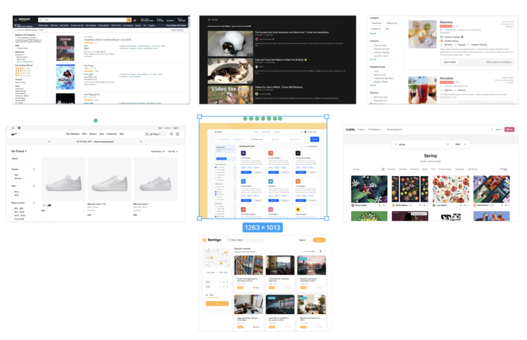
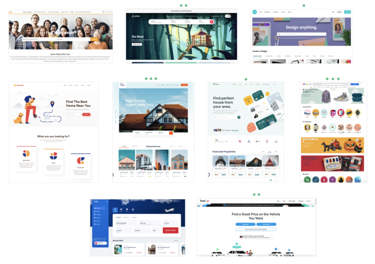
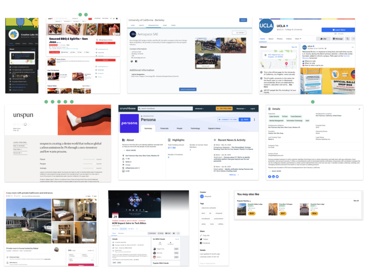
Competitive Analysis
We split our team into three— home, search, and club page. Each member of the team found other sites that had features that could be used to tackle the problems for the page they were assigned. Then, we came together to discuss and voted on what examples we liked by putting green dots on them.
Sketches
After looking at all the examples, we each drew 8 sketches for the page we were assigned. Then, we chose one sketch to expand on and bring to the table. After choosing our top sketch, we came together again to talk about the sketch we drew and then voted again on the features of each sketch.

Defining the Solution
Gathering the ideas that were popular among our team during the design sprint and our own ideas, the design team came up with features and solutions that would address the main problems we listed.
Accessibility
Organization
Icons for categories
Graphic banner with displays what OnCampus is for
Icons and quote pullout for on club pages to break down long paragraphs
Reduced color use for categories
Use Montserrat font (OnCampus font)
Make sure all pages (home, search, club) are consistent with how they look
Organize search page into two columns
Taking out the Search by interest
Making filters expandable/collapsible
Incorporate a tag search bar
Guide users in what to search in search bar
Process
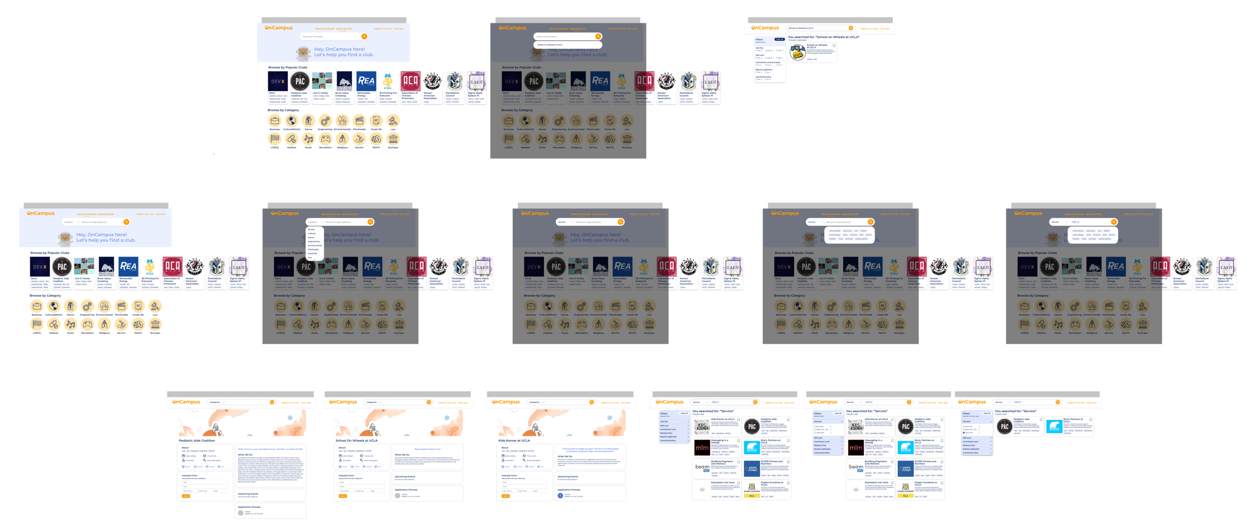
Low fidelity wireframes


Search page


After presenting the low fidelity wireframes to the team, there were a few points that were brought up that required a second iteration.
Having two search bars (tag & club name search) is confusing
Where would the browse by search button lead to?
Usability testing & iteration
After receiving feedback for our low fidelity wireframes, we made some changes and created high fidelity prototypes.
This iteration involved:
Toggle search between by category and by club name
Incorporation of tag in the main search bar
Enlarging search bar on the graphic banner to highlight its importance
With these high fidelity prototypes, we conducted 3 usability tests. The main questions we wanted to answer with the usability test were:
Is the search toggle intuitive?
Will users feel constricted with a more limited search?
Is the filter tool noticeable when collapsed?
Through the usability tests, we found that:
The search toggle was intuitive. All users were able toggle between Search by Category and Search by Club in a fast manner.
Users enjoyed the more limited search more, as it allowed them to narrow down their search and yielded better results.
Filter tool was not as noticeable and users liked being able to see all options once landing on the search page. However, they enjoyed that it did not fill the full frame of the page.
Thus, we created another iteration of the high fidelity prototype, which did not have a collapsible/expandable filter tool.
Final design
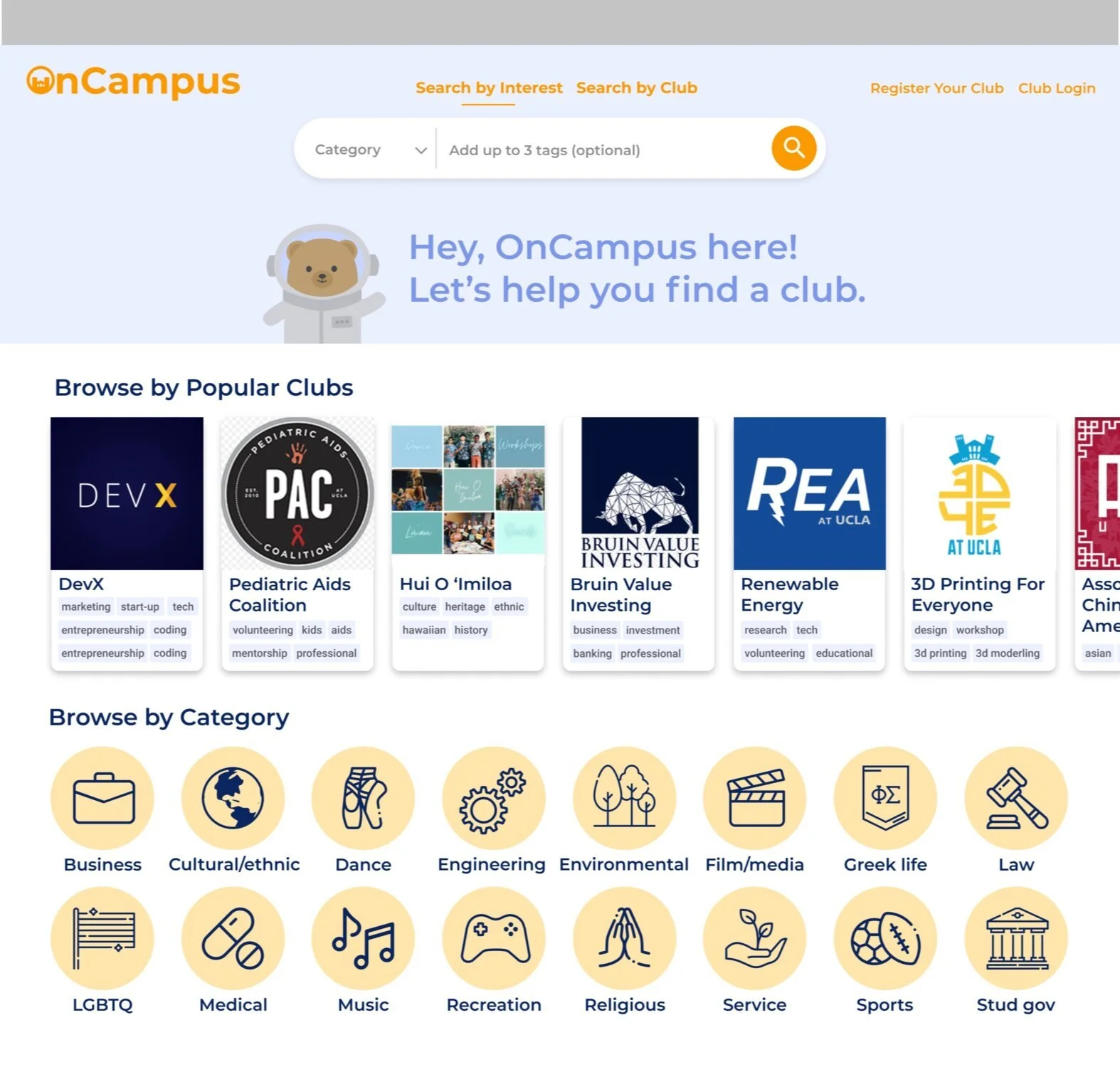
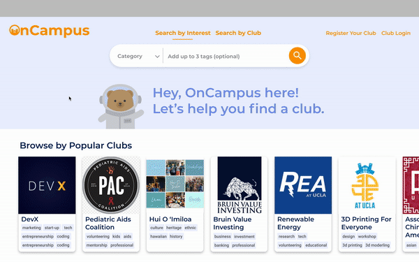
Homepage
Search function
Filter
Club page
Reflection
Clean and easy-to-navigate homepage.
The OnCampus homepage informs users about what the site is for with its graphical banner and guides users to search for clubs with visual aids such as the logos and icons. The page isn’t too overwhelming, with only three main components: Search, Browse by Popular Clubs, and Browse by Category.
Intuitive search bar to narrow down search.
Search bar allows users to search by categories and add optional tags to narrow down the search even more. This makes sure users get results that match their expectations.
Toggle for search by club option.
In order to serve users that may want to search by club names, OnCampus has a toggle option so that they can do so. This makes what is searchable more clear to the user.
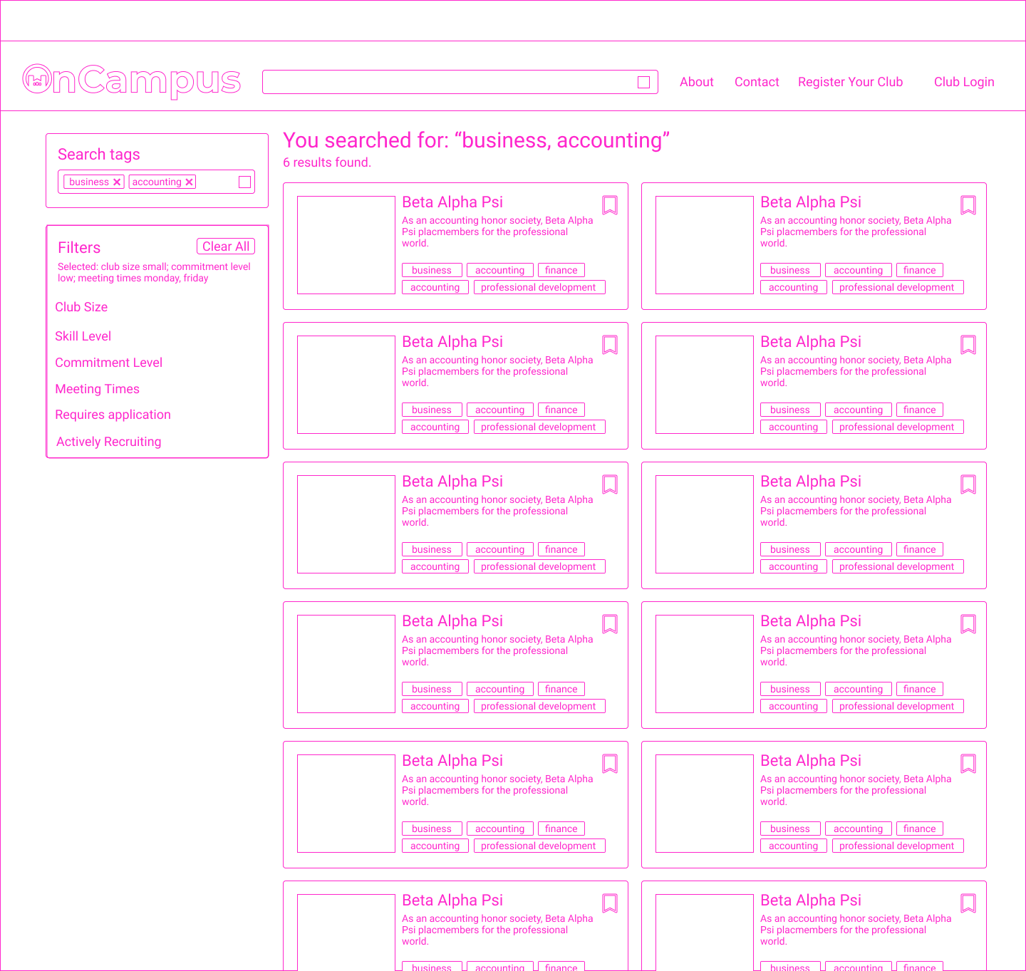
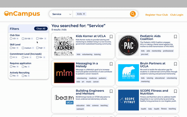
Efficient search page.
The search page shows club cards in two columns, showing 6 clubs at once, allowing users to efficiently scroll through clubs.
Clear and easy filter tool
The filter clearly defines the options and shows how many results will show up when the filter is selected, allowing users to narrow down their choices.
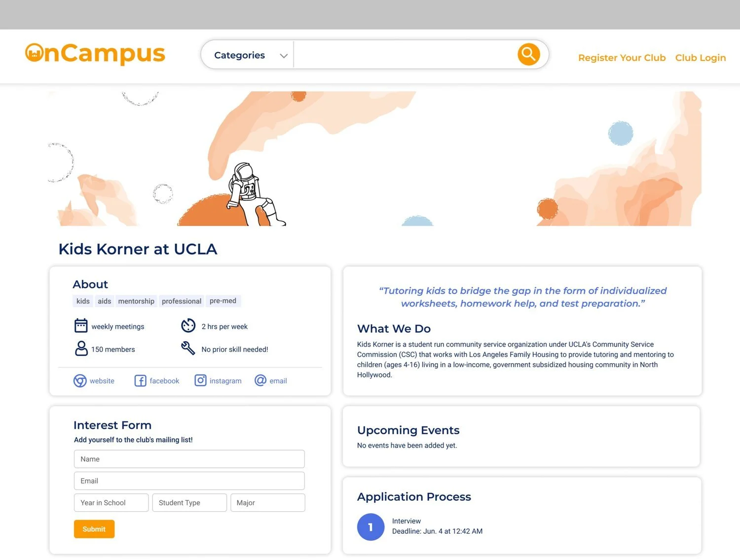
Club page with accessible information.
Club page has information broken down with icons and graphical elements so that information is more accessible to the user. They can easily scan and retrieve information they need.
What I learned
This redesign was the first time I oversaw and mentored another designer as the Product Design Lead. Because I’ve always learnt from others, it was nice to be able to mentor someone else! I was also to hone my skills in interviewing and justifying my designs when presenting to the team.
Some key takeaways are:
Teamwork makes the dream work: Through the design sprint and design critiques from the team, I got a lot of valuable feedback. By talking to my team, I was able to find solutions and find usability issues I would’ve never otherwise found.
Exploration of other sites: For this project, it was really useful to consider how other sites approach user search. By looking at others, I was able to explore solutions that may help the user experience be more intuitive.
Importance of usability tests: Usability tests are when you can truly see how users interact with your prototype. If I hadn’t conducted usability tests, I would have had implemented features that would’ve caused a worse user experience because of my assumptions on users behavior.
What’s Next
The redesign is currently being implemented by the dev team, and I’m in the process of redesigning the mobile view to match this redesign.